前端CSS Transition动画效果
一、什么时候用 Transition?
在网页开发中,我们经常需要处理以下场景:
1. 鼠标悬停时的按钮变化
2. 菜单展开/收起
3. 卡片翻转效果
4. 导航栏高亮
5. 表单输入框焦点状态
这些场景都需要平滑的状态过渡,而不是生硬的瞬间变化。这时就需要用到 CSS Transition。
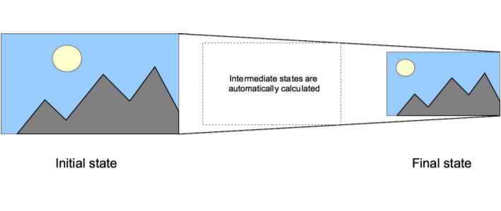
二、Transition 基础概念
transition 属性有四个核心组成部分:
transition: property duration timing-function delay;
1. `property`: 要过渡的属性(比如 width, color 等)
2. `duration`: 过渡持续时间
3. `timing-function`: 过渡的速度曲线
4. `delay`: 开始前的延迟时间
三、实战案例讲解
1. 最基础的按钮悬停效果
.button {
background-color: #007bff;
transition: background-color 0.3s ease;
}
.button:hover {
background-color: #0056b3;
}
这里发生了什么?
- 当鼠标悬停时,背景色在 0.3 秒内平滑过渡
- `ease` 表示先快后慢的变化
- transition 要放在初始状态,而不是 hover 状态
2. 组合多个过渡效果
.button {
background-color: #007bff;
transform: translateY(0);
transition: all 0.3s ease;
}
.button:hover {
background-color: #0056b3;
transform: translateY(-2px);
}
使用 `all` 的好处:
- 可以同时过渡多个属性
- 代码更简洁
- 后续添加新属性也会自动应用过渡
但要注意:
- `all` 可能会影响性能
- 有时候我们需要不同属性有不同的过渡时间
3. 实用的展开/收起效果
.expandable {
max-height: 0;
overflow: hidden;
transition: max-height 0.3s ease-out;
}
.expandable.open {
max-height: 500px;
}
这个技巧很实用,但要注意:
- 使用 `max-height` 而不是 `height`
- `max-height` 值要设置得适中
- 配合 JavaScript 切换 class 来控制状态
四、常见的错误和解决方案
1. 过渡效果不生效?
最常见的原因:
- transition 放错位置了(应该放在初始状态)
- 属性值没有实际变化
- 使用了不支持过渡的属性
/* ❌ 错误示范 */
.button:hover {
transition: all 0.3s ease;
background-color: blue;
}
/* ✅ 正确写法 */
.button {
transition: all 0.3s ease;
}
.button:hover {
background-color: blue;
}
2. display 无法过渡
/* ❌ 这样不会有过渡效果 */
.element {
display: none;
transition: all 0.3s;
}
.element.show {
display: block;
}
/* ✅ 正确方案:使用 opacity 和 visibility */
.element {
opacity: 0;
visibility: hidden;
transition: all 0.3s;
}
.element.show {
opacity: 1;
visibility: visible;
}
3. 调试技巧
- 使用 Chrome DevTools 的 Animations 面板
- 临时添加 `transition-duration: 5s` 来调试
- 使用 `console.log` 配合 `transitionend` 事件调试
记住:动效是锦上添花,不是必需品。好的过渡效果应该:
- 自然不突兀
- 提升体验但不喧宾夺主
- 有明确的交互反馈目的
- 性能影响最小化


